
Sei Labs
Simplifying token staking to drive platform adoption and user engagement
OVERVIEW
Sei was founded in November 2022 as a high-performance, Layer 1 blockchain specifically optimized for decentralized exchanges (DEXs) and trading applications. Despite its technical advancements, Sei faced a significant challenge: most account abstraction companies don’t prioritize user experience. Web3’s staking interfaces are unintuitive, making it difficult for users to navigate and find essential features or information.
MY CONTRIBUTION
I joined as Product Designer, designing the dashboard and staking flow for the responsive and the website rebrand. Worked with engineering and product management to design and launch features.
MY ROLE
UX/UI Design, Design Systems
THE TEAM
Product Design, PM, Engineering Team
TIMELINE
Shipped 2023 https://www.sei.io/
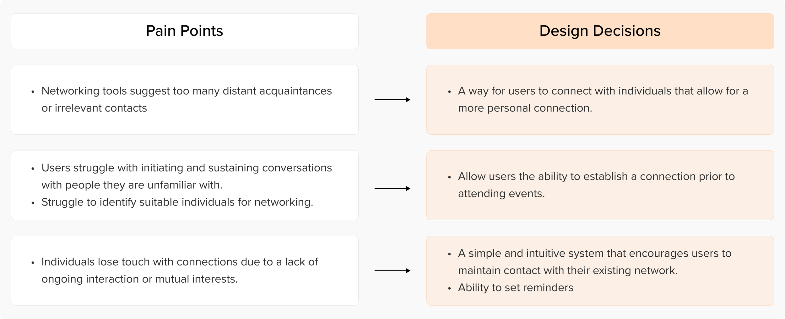
THE PROBLEM —
Web3’s staking interfaces are unintuitive, making it hard for users to navigate and find essential features or information.
Crypto token swapping is an essential part of the Web3 ecosystem, allowing users to exchange different cryptocurrencies across various blockchain networks. However, the process is often confusing and intimidating for users. If you want to swap your ETH tokens on Ethereum to SOL tokens on Solana, the current solutions are cumbersome and fraught with issues.

DISTILLING RESEARCH —
Analyzing our objectives and data
Although research was initially executed by the research team, I analyzed this our research data to understand user preferences and challenges they face and led brainstorming sessions with the team.

INSIGHTS + IDEATIONS —
Users who are looking to seek a career in a new industry are prioritizing quantity, applying to over ~100 listings a week.
While leading brainstorming sessions, I brought my key ideas to the head of product and engineering lead. Based on constraints and impact for our MVP we focused on three key features.

USER JOURNEY —
The current user journey is convoluted and takes multiple steps.
Since the goal was simplify this process, we didnt want to reinvent the wheel. I took inspiration from already succesfull platforms and wanted to provide a sense of familiarity for the user.

IDEATION: 1) STREAMLINING USER FLOW —
Focused on creating a user profile to ensure sufficient information is captured.
To address this feature we needed a user profile for new users to fill questions and basic information once.
Brainstorming and prioritizing key features for the MVP
Leading several discussions with the team, my team and I communicated and brainstormed various features that appeared to be the most critical for the MVP.

Leading several rounds of discussions and soliciting feedback from our stakeholders, we prioritized features based on balancing constraints, the cost to build and the impact. Based on all the feedback, we were able to set focus on several main features, prioritizing these for the first version of the product.
Designing and Iterating
DESIGN DECISIONS AND FEEDBACK
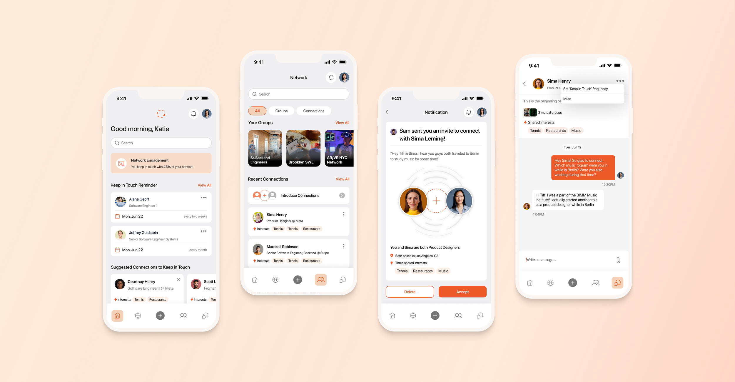
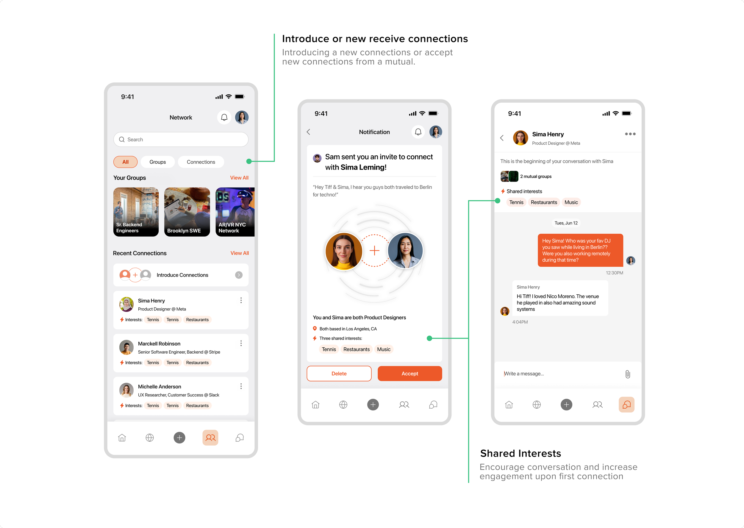
Goal 01 | Help users build a network & meet people with the same professional interests
Receiving connection invites through a referrals of a mutual connection
I spent a lot of time looking for a most efficient way provide confidence to users upon first connection. We decided to go with a connection based referral to address the quality of the connection and for users to actually initiate conversation. I referred to earlier research to understand how to incorporate simple yet informative information tags.
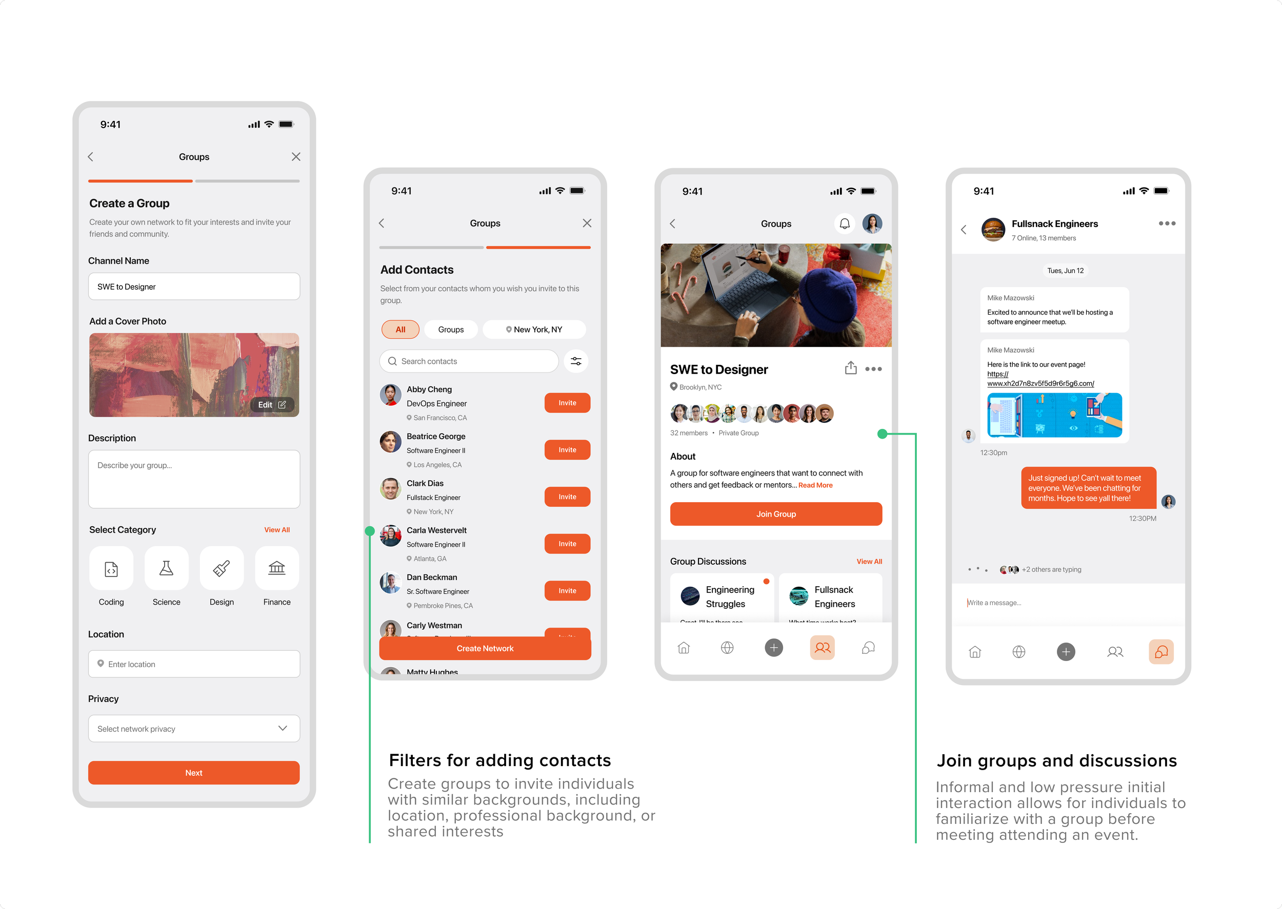
Create and join groups based off professional and personal interests
This proposed solution would allow users to create a group and invite individuals with similar interests. However, I received feedback from the engineering team whom presented a few issues. I worked on iterating and refining the content flow. So instead I presented version 2 - short form, with two sections, reducing cognitive load and even more precise filtering abilities.
A/B TESTING FOR OPTIMIZATION
Goal 02 | Help users maintain a strong network
A CRM dashboard with reminders
In our research users reported high motivation to build their network during major transitions but would often forget to follow up. The absence of immediate outcomes from networking activities led to motivational decay. In order to help users be more proactive, I suggested various iterations of the dashboard view to remind users of upcoming connections they are able to set - we discussed iterations with the team and brought two versions through A/B Testing.
Feedback indicated that users preferred seeing more keep in touch cards versus being able to easily message their connection as the button is too distracting. Users stated that they would be easily able to access Messages and Notes upon clicking on the ellipses on the top right corner of the card. Based on this, Version 1 was integrated.
DESIGN SYSTEM
Ensuring reliability and consistency amongst designs
I presented and drove conversation with the rest of the team to align on our design system. The main focus was to provide a properly annotated design system to ensure efficiency and improved collaboration during handoff to the engineering team.


The Final Solution
Receive new connections based on referrals through a mutual connection
Maintain consistent communication with new and past connections through CRM based check-in and follow up system

Encourage reciprocity by creating and joining groups
Takeaways
WHAT I LEARNED
NEXT STEPS
Embracing feedback stakeholder feedback while understanding the constraints of engineers. It's important to weigh their input thoughtfully, assessing its overall appropriateness and alignment with the project's end goals. Experimenting with designs and maintaining a holistic view ensures that decisions are not just reactive to feedback, but are also strategically aligned with the project's broader vision and user needs.
Awaiting development and continue phase II of usability testing. Waiting for the engineering team to fully develop screens and to continue Phase II of iterations post launch.
NEXT UP ↗