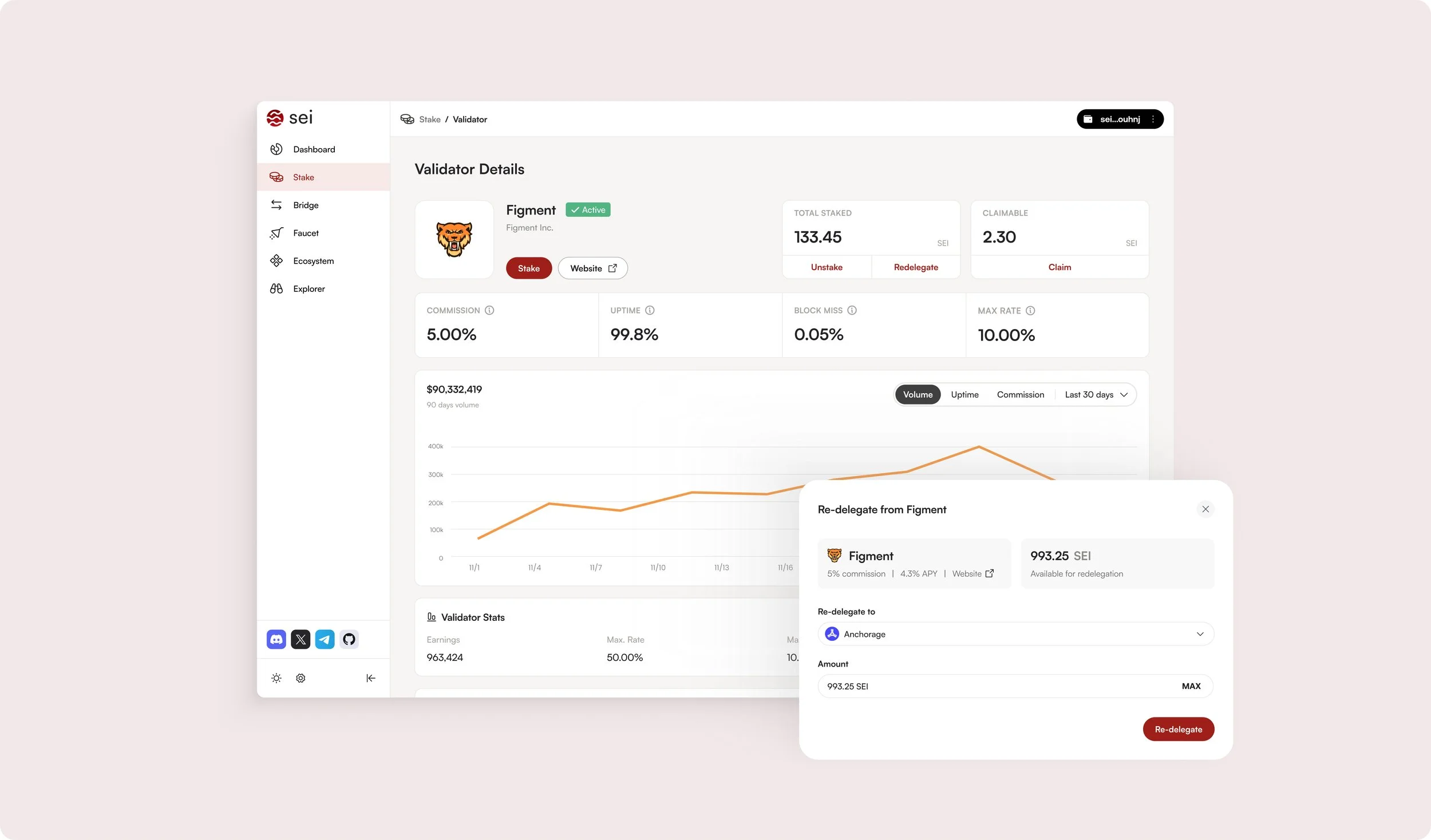
Increasing network stability and user retention
OVERVIEW
This project aimed to tackle user disengagement on Sei, the fastest Layer 1 blockchain built for decentralized trading. The focus was on understanding why users unstake their tokens & creating a solution that balances user needs with business goals.
CONTRIBUTION AND OUTCOMES
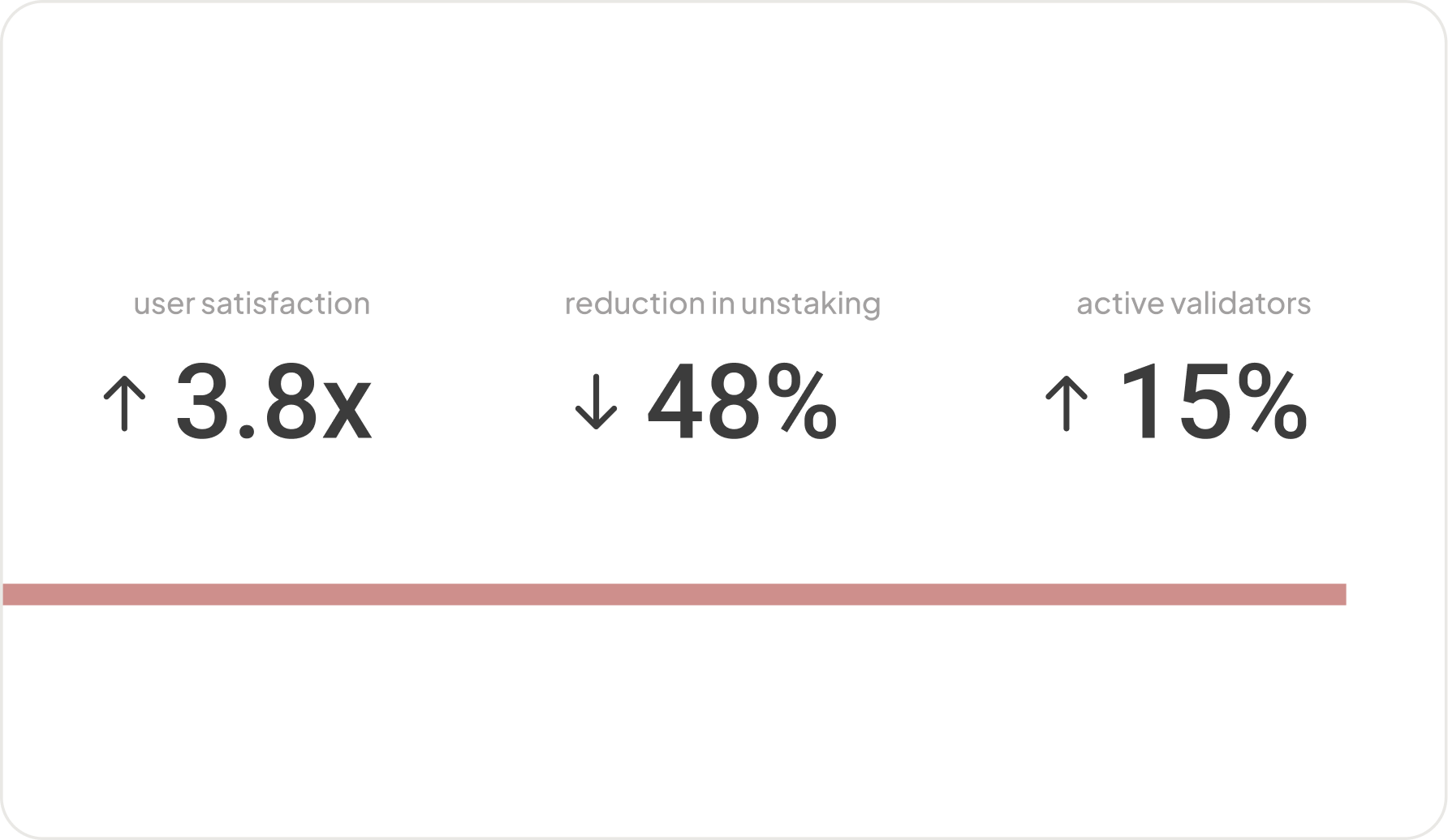
Led strategy and UX for token redelegation, aligning technical, regulatory, and financial constraints to ship a solution that preserved network stability while improving user flexibility. The feature reduced unstaking by 48% and increased active validators by 15% post-launch.
MY ROLE
Lead UX designer, UXR
THE TEAM
PM, ENG, Legal, Finance
TIMELINE
Shipped 2024 https://www.seilabs.io/
CONTEXT —
What is token staking in the world of crypto and on Sei
Token staking on Sei lets users lock up their tokens with a validator to support the security of the network. A validator is a participant of the network that actively confirms transactions. In return for staking tokens, users earn rewards in the form of more tokens.

THE PROBLEM —
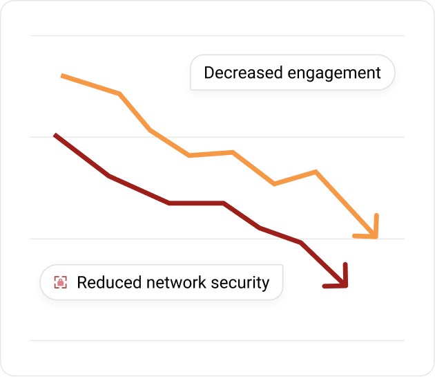
Users are unstaking their tokens leading to decreased engagement and lower platform retention.
Staking is important for keeping the network secure, but issues like validator mistakes, market changes, and limited options for switching validators are causing users to lose trust and interest
THE STRATEGY —
Simply trying to fix retention by adding more incentives for staking wouldn’t address the root problem.
Retaining users isn’t just about offering better rewards. It’s about removing barriers that force them to unstake in the first place. I wanted to reduce friction by giving users more control. I focused on creating a solution that improves flexibility to keep users engaged.

SOLUTION —
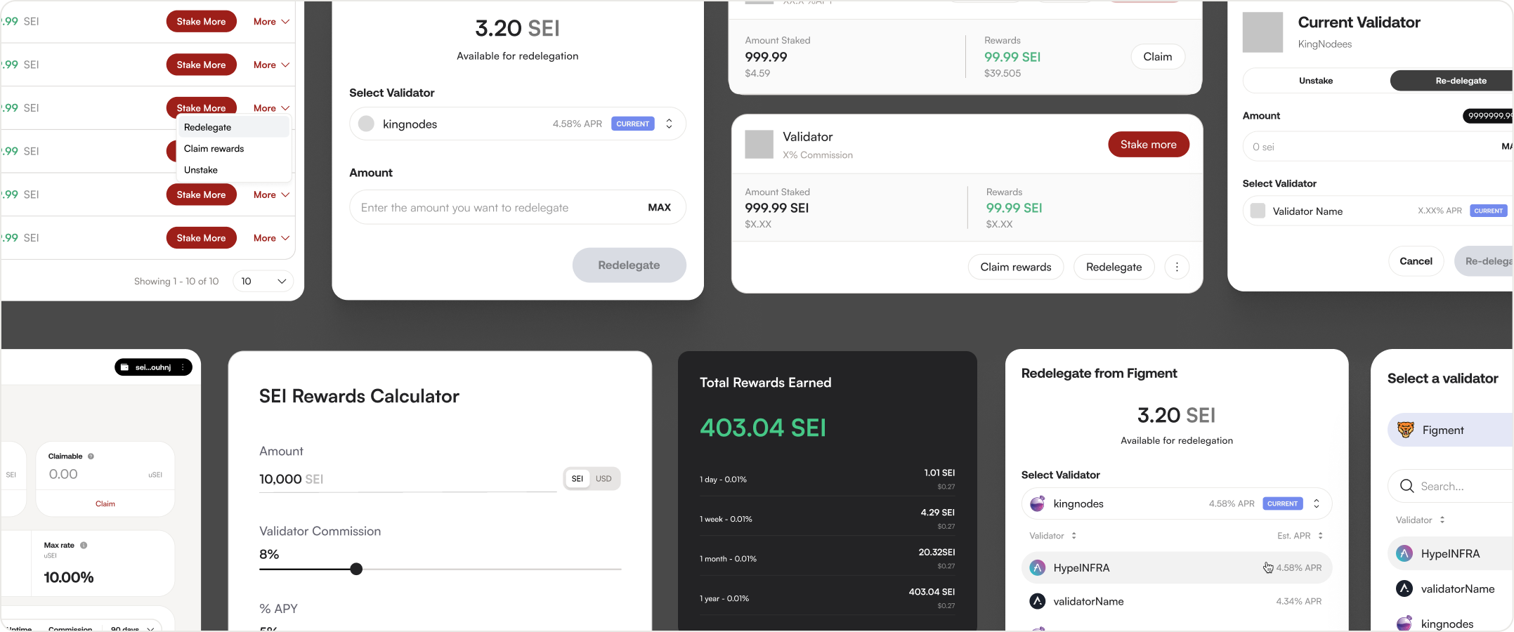
Introduce a new feature — token redelegation. Eliminating unbonding delays, and keeping rewards uninterrupted.
After analyzing user behavior, feedback and stakeholder discussions, we aligned on a solution to improve user retention by introducing a redelegation feature. Our hypothesis was that allowing users to switch validators without unstaking would reduce friction and keep users engaged with the platform.


BUILD —
I wanted to understand not just the quantitative data that we had, but the 'why' behind user behavior.
Our growth team shared helpful metrics, but I noticed we were missing key context. I advocated for adding user research, by pointing out some gaps in our understanding. After getting buy-in, I led a round of interviews which revealed core issues.

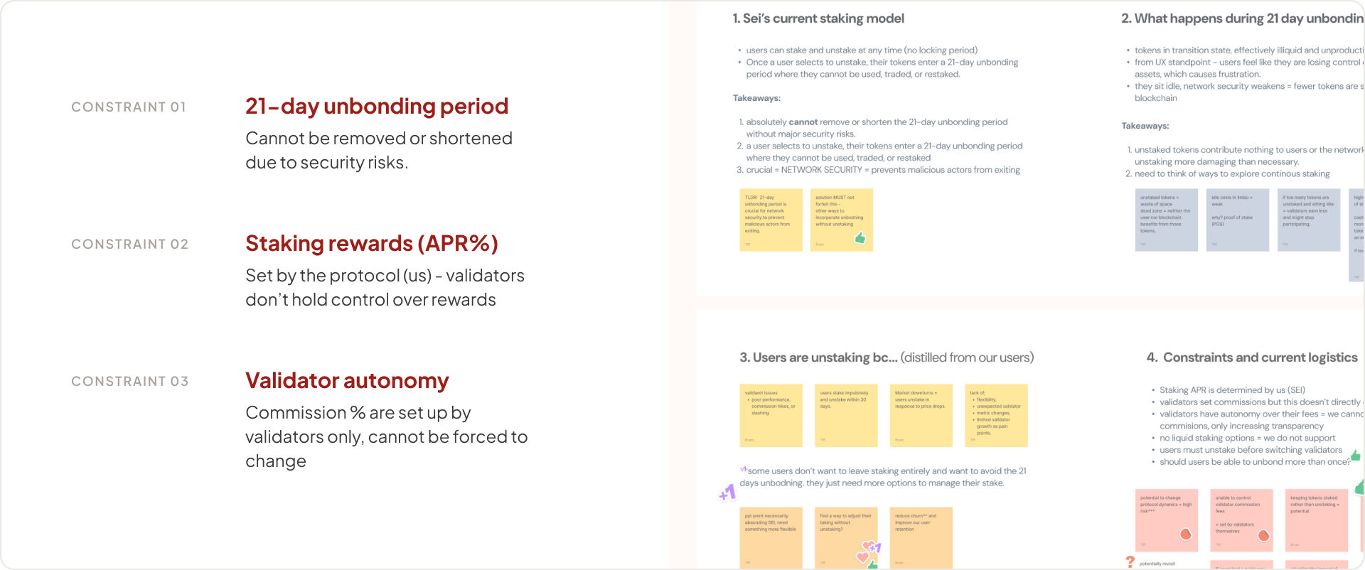
Led cross-stakeholder workshops to identify technical constraints within our protocol and surface potential legal considerations early.
This project was a challenge due to so many cross functional constraints, from business to regulatory and legal, as well as the protocol engineers. To navigate this complex space, I led multiple workshops to align stakeholders and surface key limitations early on.
I explored many solutions, however, token re-delegation was the most pragmatic
I leaned heavily on discussions with stakeholders to assess: feasibility within the staking infrastructure and implementation timeline. Token re-delegation emerged as the most pragmatic solution. Although we weren’t able to test all ideas directly with our users, we inferred values from existing user behavior, the potential to reduce idle tokens and keep users engaged without requiring them to fully exit the ecosystem and minimal implementation risk compared to other, more speculative ideas.
THE IMPACT —
Unstaking rate decreased from 27% → 12%
The redelegation feature proved to be a critical improvement in SEI’s staking ecosystem, positively impacting network security, user retention, and staking efficiency.
Takeaways
LEARNINGS
Early collaboration with cross-functional teams is crucial - aligning technical feasibility as early as possible with user needs can really ensure content strategy and technical constraints were addressed together.
Behavioral data is just as important as transactional data - Quantitative blockchain data tells part of the story - combining it with qualitative insights leads to better product decisions.
EXPLORE MORE WORK ↗
