Sync
Empowering couples to achieve financial transparency and growth

Background
Financial incompatibility is the top cause of divorce in the US and a major stressor in long-term relationships. Managing shared expenses, setting financial goals, and tracking spending can be challenging, particularly if couples have different spending habits and financial priorities.
While there are many great personal finance apps out on the market, couples still face challenges and a fragmented experience including the lack of:
ROLE
UX/UI Designer
PROJECT
Mobile End-End App
TIMEFRAME
May-June 2023
THE PROBLEM
Current financial tools lack the features for transparent and collaborative financial management for couples, leading to a fragmented experience, frustration and relationship strain.
THE SOLUTION
To provide a personalized experience for each partner while fostering a sense of shared responsibility, and accountability. By addressing the unique financial management needs of couples, we can improve communication, and support better financial decision-making for both.
Research
SECONDARY RESEARCH
The market lacks a solution that involves both parties
I expanded my topical knowledge by speaking to several couples to better understand this issue. Complementing my preliminary research, I also did a competitive analysis to seek if there are any existing solutions available to users. As an avid user of personal finance apps such as Mint, I evaluated its features objectively to understand its strengths and weaknesses.
While several competitors specialize in features such as budgeting, and bill payments, almost all the apps I’ve researched fell short on a few things. Most apps are catered for the ‘individual’ user instead of couples, not allowing the transparency between all accounts as a couple - no tools that help couples communicate changes made to their budgets.
USER INTERVIEWS
Lack of transparency leads to excess spending and frustrations
The core of my research was a series of 1:1 interviews. All of identified as couples who are in long term relationships or married, who track or want to track their finances together.
I started my journey with a broad problem: couples lacked the tools to navigate their net worth together and to be financially transparent, leading a lack of communication and arguments. However, as I conducted user research and testing, I discovered that the although users were interested with overall net worth and investments, they struggled with budgeting for joint goals that they set out to achieve.
USER INSIGHTS
What frustrates user’s the most?
Define
USER PERSONA AND JOURNEY
User interviews review a distinct persona pair
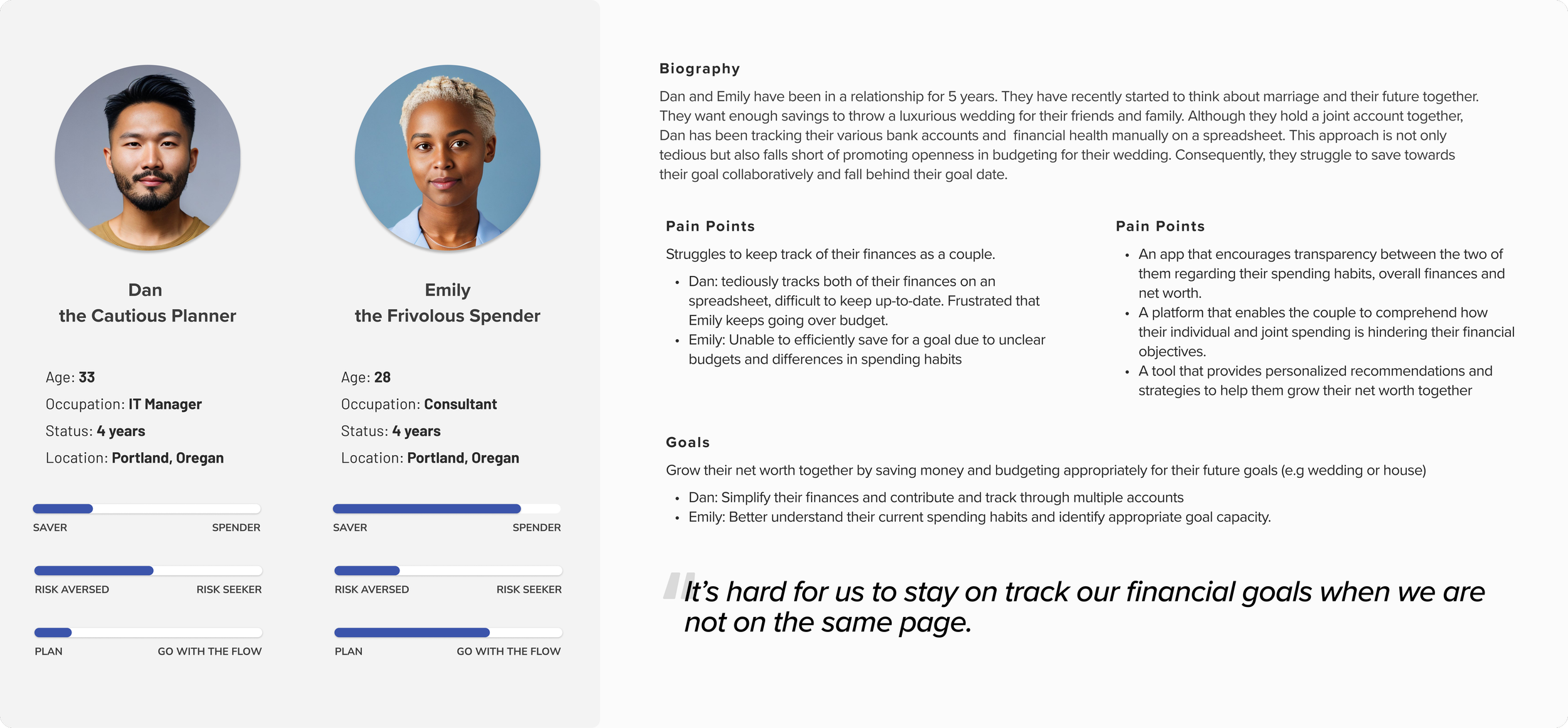
The culmination of my research revealed a key type of couple from insights gathered through user interviews - representing couples who struggle to reach their financial goals together. I delved deeper into their behaviors and pain points to make the personas realistic. Furthermore, by incorporating key attributes and struggles from the persona pair, this is a depiction of a typical journey that Dan and Emily may encounter as they navigate their financial goals.
Ideate
AREAS OF OPPORTUNITY
How might we create a comprehensive platform to help couples increase transparency, encourage communication, and track their goals seamlessly over time?
FEATURE MATRIX
Prioritizing the most important features
With my problem statement and key insights in mind, I devised a feature roadmap. I wanted to focus on a few key things, however, the need for communication and reminders were important!! Therefore, I made sure to include - partner notifications/approvals, budget recommendations and dashboard.
INFORMATION ARCHITECTURE
Focusing on user flow and envisioning flexibility
Financial opinions and standings can vary greatly from couple to couple due to a variety of factors - hence providing users with a flexible platform with adaptable preferences, settings, and track from different bank accounts within the app. I created a user flow that outlined the paths that a user would take to create a goal, set budgets and approve notifications.
Design
SKETCHING & MIDFI WIREFRAMES
So how might we actually solve our problem?
I carried out a series of rapid sketching. This allowed me to examine prevalent design patterns in competitive apps and helped me in recognizing which patterns should be incorporated into Sync to provide a sense of familiarity to users. Focusing on our priority features and user flow above, it was imperative to have both partners be a part of the goal setting process.
Select sketches and mid-fi screens:
DESIGN SYSTEM
UI Design to evoke trust and ambition
I chose the shades of blue to evoke the sense of trust and security. In a financial app where users are dealing with sensitive information, such as personal finances and shared expenses, instilling a sense of familiarity and trust is crucial. Managing finances can sometimes be stressful, particularly in a couple's dynamic where money matters can lead to disagreements. The presence of blue can help reduce anxiety and create a more pleasant user experience.
Test
USABILITY TESTING WITH MIDFIs
Communication styles vary drastically between couples
Two rounds of usability testing across two fidelities - first round used mid fidelity screens and tested the coherence of the overall flow and gather feedback effectively. I tested the mid-fidelity prototype with five participants who are in long term relationships and/or married and are working together with their partner to manage their finances. Participants were asked to complete three scenarios: create a joint goal, edit a budget, and approve a joint goal/change to a goal.
CHAT / APPROVALS
4/5 users stated that they wouldn’t actually use the chat function within the app.
Solution:
Remove chat function and incorporate approval functionalities within the notification tab to ensure convenient access and seamless integration with other notifications.
ASSIGNING ACCOUNTS
3/5 users weren’t comfortable with automatically ‘demanding’ money from their partner.
Solution:
Instead of a ‘harsh’ and direct request to notify a partner, I adopted a more subtle approach by integrating a 'request a contribution' feature into the flow.
3/5 users users concerned about surpassed the monthly contribution limit while assigning accounts + contributions amounts.
Solution:
Add a calculator at the bottom of the page, empowering users to input their contributions accurately and aligning with the monthly suggestions.
USABILITY TESTING WITH HIFIs
Improving flexibility through more usability testing with HiFi prototype
The second round of usability testing consisted of seven participants with the same criteria and using a HiFi prototype. This version user flow and flexibility was improved. This updated version also includes minor changes such as alignment and design consistency.
BUDGET BREAKDOWN
5/7 users did not know that cards within accordion were clickable
Solution:
Added outline and carrot to indicate more information and to align with current system designs.
4/7 users did not understand iconography
Solution:
Added clarifying caption
APPROVING JOINT GOALS
6/7 users were confused why there were two buttons to ‘approve’ and ‘confirm’ goal
Solution:
Removed first approve button and replaced with a radio button selection.
Final Design
MVP DESIGN
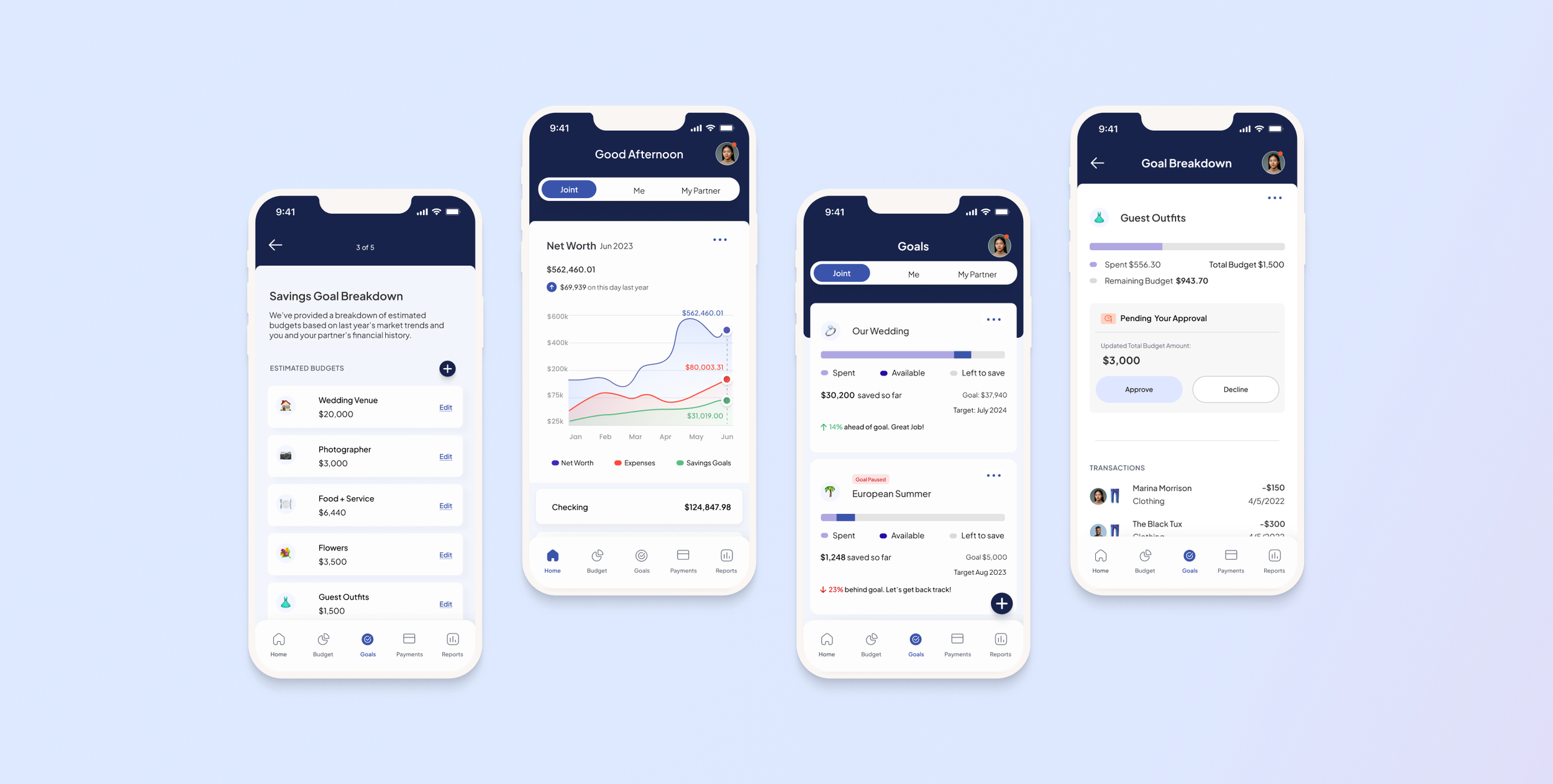
Introducing Sync, the mobile app that empowers couples to efficiently plan, collaborate, and achieve their shared goals seamlessly and transparently.
Transparency with a unified dashboard
Providing a clear overview of the entire financial situation for both partners. This transparency helps build trust and ensures that both individuals are on the same page regarding their financial goals and responsibilities
Intelligent goal recommendations
Leveraging AI algorithms to provide personalized insights and recommendations to couples.
Sync analyzes spending and saving behavior to offer tailored suggestions on optimizing savings, and staying on track towards their goals.
Flexible goal allocation
Enable couples to allocate goals and savings across different accounts based on their preferences and priorities.
Simple and intuitive interface for couples to distribute funds to specific goals within each account, promoting personalized and flexible goal tracking.
Coordination and approvals
Customizable request and approval functionalities that empower couples to personalize their level of transparency and communication with each other.
Addendum
WHAT I LEARNED
Complex User Dynamics. Couples have unique dynamics and varying financial situations. I had to consider how to accommodate different levels of involvement, decision-making dynamics, and communication preferences within the app.
Focus on tradeoffs. Ideas never go as planned, there will be so many iterations that may change during the course of the entire project. What was intended in the beginning may be far from the outcome in the end. I went through so many versions of lofi, midfi and final prototypes. It’s important to realize that with each iteration, there is a tradeoff for something that works better for the end user.
WHAT’S NEXT?


